decluttering communities
Company: olio
Role: Product designer
Product: Mobile app & rebranding
Olio connects neighbours with each other, and with local businesses; This way surplus food can be shared, not thrown away. Maybe is food nearing its sell-by date in local stores, spare home-grown vegetables, bread from a baker, or the groceries in someone’s fridge when available. Olio started as a food waste app but today it can also be used for non-food household items.
When I joined them my focus was on the homepage and navigation as they were cluttered, complicated and counterintuitive. This project aimed to declutter the UI, and simplify home and navigation while prioritising the overall experience towards the “adding” features. This is because “adders” are regarded as the main users (and the offering itself) of Olio, followed by volunteers and “requesters”.
Me and my PM run a thorough UX audit of the areas of our scope, highlighting all that was confusing.
Once we located all the most perplexing details we organised them into different macro-categories, this allowed us to produce a feature review table. This living document would give us a bird’s eye view of all that was needed to either Remove, Move or Improve in the app.
When it then came to plan for design work and developers’ efforts, we asked for the assistance of the squad’s engineering team to populate and organise a prioritisation matrix to measure the feasibility of every solution we proposed.
What we ended up with was a detailed roadmap of the work to be done on the entire app for the next 2 quarters, while accounting for stakeholders’ requests.
before and after + the prototype
AFTER THE PROJECT
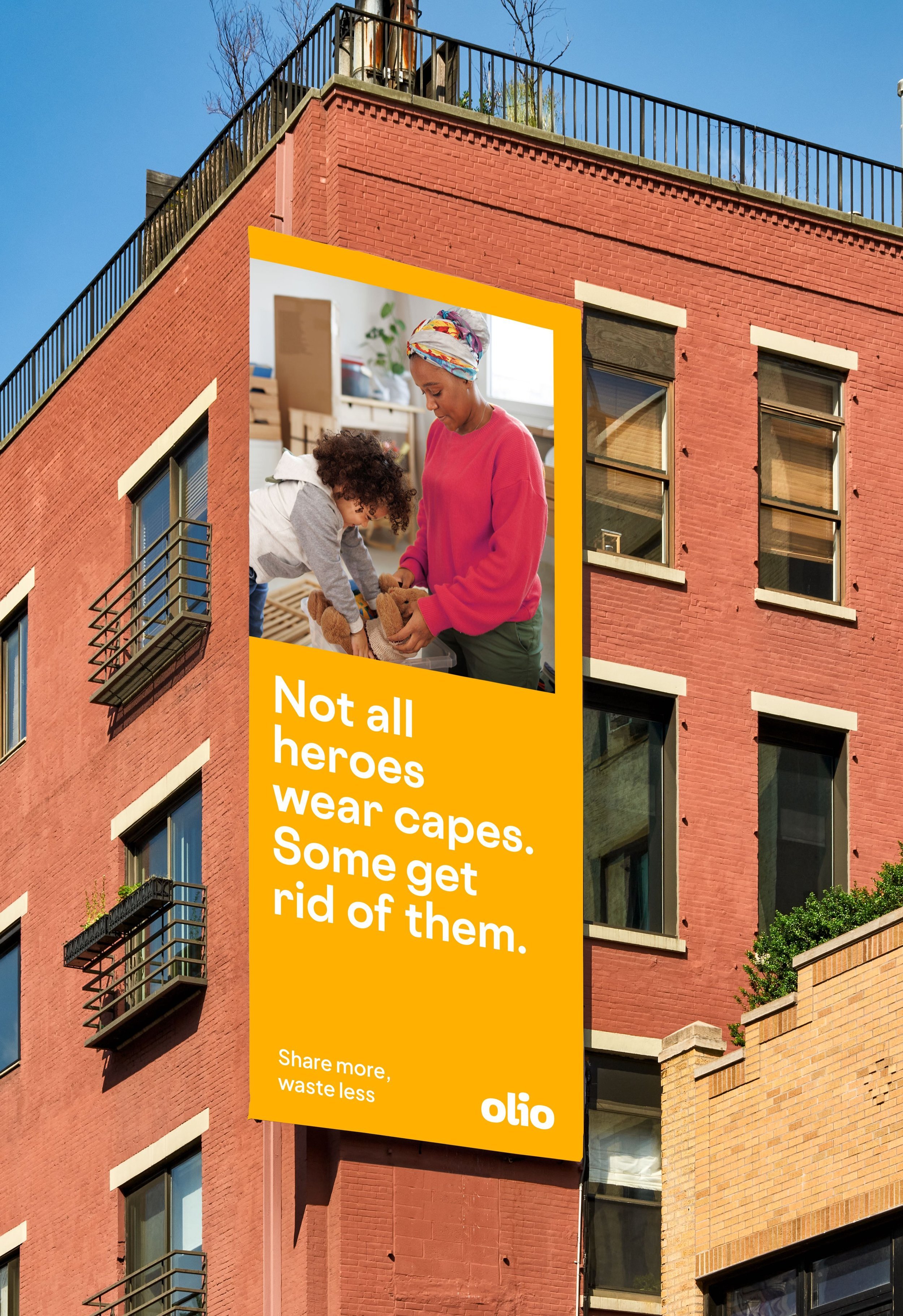
During my time at Olio, the company went through a rebranding with the aid of an external agency and was led by me and other designers in the product team.
We assisted the efforts on accessibility and overall feel, while simultaneously reshaping the design system, All this was then released after I left the company, as seen here.


